


Client
Insurance broker
Task
The logo and the identity should create a cohesive image and be recognizable. Target audience - owners and managers of organizations of any type of business, wishing to receive a high quality comprehensive service in the field of insurance
Created on 20 days

Getting Started
Before moving on to the design, I jointly with the client, discussed all their wishes and highlighted the main theses:
The name "Kristo" was conceived by the founders from the word "crystalline".
Company slogan: «Crystal clear insurance»
Associations: protection, security, custody, service, openness, honesty. The drop is a symbol of honesty and transparency (fits the mood of the slogan).
Hands - a symbol of safety, custody and caring
Hands - a symbol of safety, custody and caring
The design is concise, minimalist, easy to understand, visually readable
Proposed solutions
I have studied many logos of insurance and brokerage companies and the vast majority use a shield in the logo. So I decided not to do the shield in any of the versions.
As for the hands (care), this is also a very ridden topic and I have not come across any beautiful (harmonious) solutions.
As for the hands (care), this is also a very ridden topic and I have not come across any beautiful (harmonious) solutions.
I made a lot of variations with the drop at the stage of the sketch, and everywhere there was a thin line with the cleaning company. One of the variations, it will be with the drop and in it I will describe how I played with this solution.
In total, you will see 4 variants of the logo
In total, you will see 4 variants of the logo
Option 1
The sign in the logo is an image of a crystal, but not in its classic form so as not to evoke an association with a jewelry company. The image of the crystal is consonant with the name, and also reflects the essence of the brokerage company through versatility.
EngraversGothic is a confident, catchy and modern typeface.
EngraversGothic is a confident, catchy and modern typeface.
Option 2
We go back to the image of the crystal again. Thanks to the color solution it again, has no resemblance to the jewelry company, and also evokes an association with the coat of arms of the VSU. This association leads to the image of a defender.
The e-Ukraine Head is a modern, unusual typeface that was developed for the design of the DIA system.
The e-Ukraine Head is a modern, unusual typeface that was developed for the design of the DIA system.
Option 3
The sign depicts a drop. The drop is pierced with lines. It is a symbol of an intersection with many roads, as well as, the crystal we are already fond of. The set of roads is a metaphor of a great choice among insurance companies.
Kyiv Type was created for the alternative brand of Kyiv and is free for commercial use. The font has interesting proportions, bright and memorable.
Kyiv Type was created for the alternative brand of Kyiv and is free for commercial use. The font has interesting proportions, bright and memorable.
Option 4
In this version, we also refer to the metaphor of a crossroads. The fact that the resulting asterisk is not centered draws extra attention to this sign. Also hidden in the asterisk is the capital letter K from the name.
It is based on the Miratrix Normal headset, but it has been changed beyond recognition.
It is based on the Miratrix Normal headset, but it has been changed beyond recognition.
Sketching stage


Final Version


Instagram

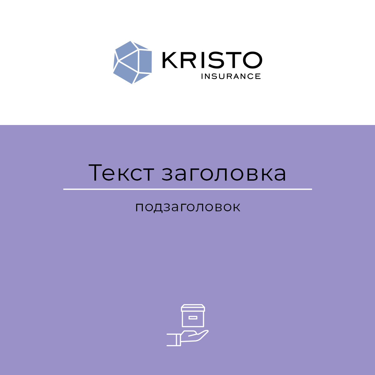
Template 1
Template 2
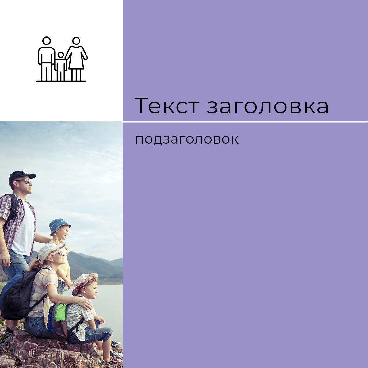
Template 3

Icons for assigned stories


Rate this project
Let's discuss your project?
Contact me by email
Contacts
Or you can leave a request through the form and I will contact you within 1 hour (from 9 to 21)


Telegram
WhatsApp
Messenger


