


Client
Chain of shoes, clothes and accessories stores for the whole family
Task
Create a brand and fill it with meaning. Build brand awareness and reach new audiences. Prior to this, stores opened without a single style and could differ significantly from each other.
Developed in 40 days


Input data
Several elements of the brand, at the request of the client, must remain unchanged.
1. Name "Confiscate"
2. Descriptor "warehouse store"
3. Yellow color
1. Name "Confiscate"
2. Descriptor "warehouse store"
3. Yellow color
The visual identity should emphasize the past positioning "warehouse-shop"
The problem was also that the store's customers associated the confiscation only with shoes, and there is a huge selection of clothes, bags and accessories for the whole family.
The problem was also that the store's customers associated the confiscation only with shoes, and there is a huge selection of clothes, bags and accessories for the whole family.
Our Flaws
Our advantages
Insights of TA
Barriers for TA
Why are they buying it?
At what price?
Who are we selling to?
What are we selling?

Beginning of work
If you want to increase demand, limit access
After our first meeting in one of the capital's stores, I found out that there is a little more than a month to update the brand. The opening of two new stores with new branding was already planned for the end of November
Lines for goods, the inability to buy the same product in different stores, the inability to buy online - this is a scarcity strategy. It works, but dictates a certain tone of voice to the brand.
There was not much time, so I immediately got to work:
Introduce a strategist and copywriter
having received an advance payment =)
Conduct a zoom call with the client and all participants in the process
After the conversation, within a week, we formed answers to questions
Impudent. Bold. Frank. Youth
Our main enemy is embarrassment and shame. Gotta tame him
There is a feeling of awkwardness, a certain sense of guilt or shame for having to buy in the low-budget segment.
We want to work with awkwardness by turning it into another emotion:
► I have everything under control
► I'm a good guy, I pull everything
► I myself choose where and on what and how much I spend
We want to work with awkwardness by turning it into another emotion:
► I have everything under control
► I'm a good guy, I pull everything
► I myself choose where and on what and how much I spend
We have developed two brand strategy concepts
- Here you choose
- Shopping without marketing
We have developed two brand strategy concepts
Here you choose
Shopping without marketing


Concept #1
Often the opportunity to choose a variety of models is provided to people in the medium, medium plus, high segments. The confiscator refutes this dogma and is guided by the desire to give a person just a lot of cool shoes and clothes. Choice - product advantage
Positioning
A store with a huge assortment, the ability to choose from a million models of your own, at a low price.
Brand message
Here you choose
Logo


style-forming elements
Concept #2
In the high and medium segments, there is carefully thought out marketing, where it is based on the desire to stand out, to be different from everyone else, the desire to appear super cool, exceptional and fashionable.
But what if we assume that marketing is the main margin on the cost of a pair of shoes or clothes. What if we prefer to give people a fair price, but no show-offs. Just a lot of normal clothes and shoes without marketing extra charges. Just for people.
But what if we assume that marketing is the main margin on the cost of a pair of shoes or clothes. What if we prefer to give people a fair price, but no show-offs. Just a lot of normal clothes and shoes without marketing extra charges. Just for people.
Positioning
Shop with clothes and shoes for those who do not want to overpay.
Brand message
Shopping without marketing
Logo


“
We choose the first concept, but we want to see a different sign in the logo
Finalization of the concept
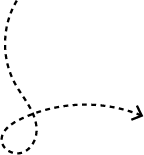
We started developing the first concept. The client asked for more associations with the warehouse in the visual component and to replace the sign in the logo, while retaining the arrow.
What can not be found in the Confiscation!
There is only one rule: here you choose.
There is only one rule: here you choose.
Confiscation has great prices
and a look for the whole family.
and a look for the whole family.
in the shopping center all the discounts are bullshit, here is Black Friday every day!
Looking for a cool choice and price? Go to Confiscation! For you and your family.
More than 20 short poems were also written to reflect the brand's new spirit. These rhymes can be found on posters and will also be played in stores through the audio system.
Working with the sign in the logo


1
2
3
4
The client chose sign #3 and we added a descriptor to the logo. Here's what happened in the end


Visual identity
RGB: 243 224 59
CMYK: 100 80 35 20
HEX: F3E03B
RAL: 1018
CMYK: 100 80 35 20
HEX: F3E03B
RAL: 1018
RGB: 34 34 34
CMYK: 0 0 0 100
HEX: 222222
CMYK: 0 0 0 100
HEX: 222222

Montserrat (black)
Druk wide
Graphic elements of the identity


Rate this project
Let's discuss your project?
Contact me by email
Contacts
Or you can leave a request through the form and I will contact you within 1 hour (from 9 to 21)


Telegram
WhatsApp
Messenger


Vladimir Ostapets
Chief Operating Officer, Jivoe Delo
Work with Anatoly began on the recommendation, which consisted of one phrase - you will not regret it! Finding a contractor who knows his business, is ALWAYS in touch, works on time, with an optimal payment and settlement system, will always tell his opinion and offer solutions, REALIZE any wishes and ideas (reasonable) - worth a lot!
Anatoly is a person whom I WANT to recommend and there is no fear that this recommendation will not justify itself.
You will not regret!
Anatoly is a person whom I WANT to recommend and there is no fear that this recommendation will not justify itself.
You will not regret!
Anton Gubenko
Product Owner в E-notice
An excellent specialist in his field. After the terms of reference proposed by us for the landing, he proposed constructive and significant changes and additions. The design kept in our style and took into account all the wishes - In general, everything was cool and we will definitely return to it with new projects!!!
Yakov Zamay
Marketing, Auto Service AIVA
Excellent specialist! I ordered a logo + animation for a car service. What I want to say is that there were a lot of people accepting the job (4 people), which complicates the work, since everyone has their own opinion and taste. But Anatoly brilliantly coped with the task, embodying the wishes of all participants in the order, created a logo that looks cool and is remembered from the first time, it also has a thoughtful and thoughtful nuance that has great meaning for us.
The process of interaction during work is as convenient and friendly as possible. Recommend!
The process of interaction during work is as convenient and friendly as possible. Recommend!
Maria Butler
CEO, New Smile Dental Group
From day one Anatoliy was there to help us above and beyond in every aspect of creating the website for our dental office. We had such a great pleasure working with him. He is very professional and always got back to me on time. Anatoliy and I discussed the ideas in my mind and confidently gave me feedback and made me comfortable to proceed. He is super friendly, positive and creative too. We definitely recommend his services to everyone, and we will continue to use it. Thank you Anatoliy!
Alexander Ponomarenko
CEO, Amteh
I ordered a website for the enterprise, amteh.com.ua. Anatoly offered several options with developed logos, branding, etc. I really liked the professional approach, we are still cooperating.
We also contacted him about the development of outdoor advertising, the result exceeded all expectations!
We also contacted him about the development of outdoor advertising, the result exceeded all expectations!
Artem Snitko
CEO, Hitme
Anatolii designed the logo and website for me. I was very pleased with the work! A creative designer, at the same time sensitive to the wishes and wishes of the client. Separately, it is worth noting punctuality, organization and responsibility.
As a result, I got a wonderful functional website and a logo that my clients liked!
As a result, I got a wonderful functional website and a logo that my clients liked!