Client
Educational courses on event management
Task
In 3 years of operation, the company has expanded the range of training courses and managed to accurately identify the core of the target audience. My task was to update the visual identity in order to fully meet the expectations and needs of the target audience.
Created on 30 days

Introductions
1. Make the identity continuity with the main Rockets Event brand through the theme of space, and maintain continuity to the old logo.
2. The core of the CA - girls 25-35 years old who want to change their field of work or develop new skills.
3. The color palette should be close to the core of the target audience.
2. The core of the CA - girls 25-35 years old who want to change their field of work or develop new skills.
3. The color palette should be close to the core of the target audience.
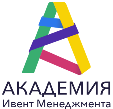
Old Logo
Logo Rockets Event
Getting Started
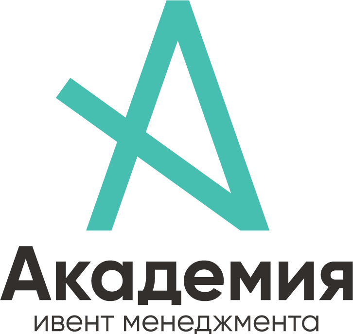
The graphic element is part of an unfinished star. It lacks one point for the star to be complete. Also, this element is the prototype of the letter A and retains continuity with the past logo
The essence of the service

Before moving on to the design, I worked with the client on their brand positioning. Which in the future, through a metaphor, and evolved into the design of the visual identity.
An educational platform that helps make the Event World more professional and better.
Brand message
Letting go, but not letting go
The brand promise
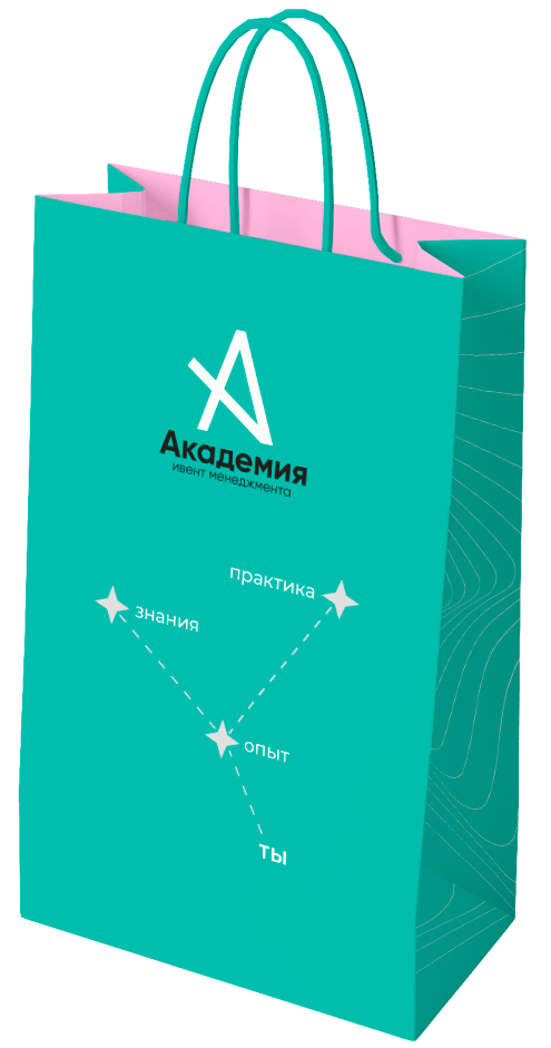
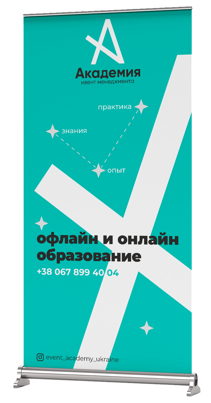
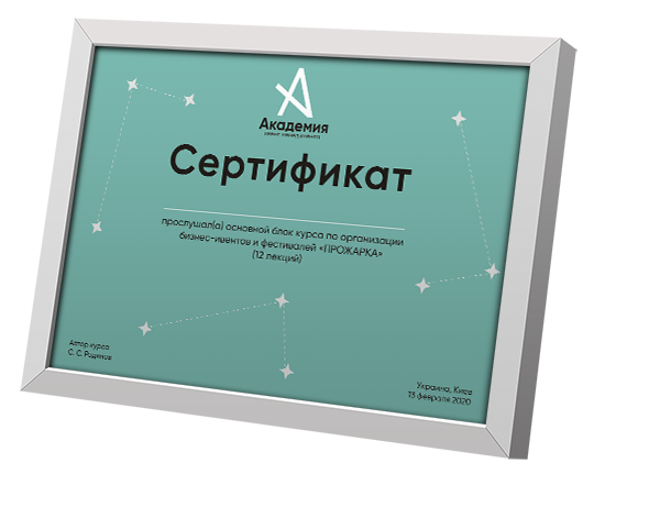
Knowledge-experience-practice
Metaphor
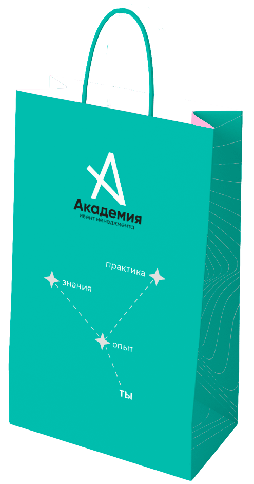
Polar Star
If you happen to be caught at night in the middle of the wilderness, the place is not suitable for spending the night, and you left your compass at home or broke it, that's where the ability to orient by the stars comes in handy. The polar star is always above the northern horizon in the Northern Hemisphere, which allows you to use it for orientation.
Night = desire to change lives
Stars = many choices
Academy = polar star
Stars = many choices
Academy = polar star
Positioning
A Guide to the Event World
New Logo
The concept


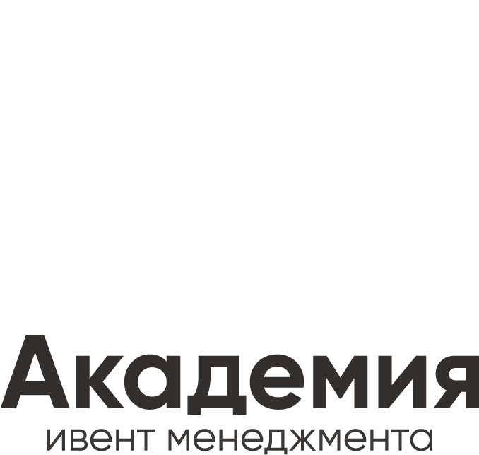


horizontal logo

Corporate colors
Turquoise:
RGB - 70 191 176
CMYK - 66 0 38 0
#46bfb0
RGB - 70 191 176
CMYK - 66 0 38 0
#46bfb0
Graphic elements


Black
RGB - 40 40 40
CMYK - 40 40 40 85
#282828
RGB - 40 40 40
CMYK - 40 40 40 85
#282828
Light gray
RGB - 226 226 226
CMYK - 0 0 0 15
#e2e2e2
RGB - 226 226 226
CMYK - 0 0 0 15
#e2e2e2
Pink:
RGB - 247 191 232
CMYK - 0 40 0 0
#f7bfe8
RGB - 247 191 232
CMYK - 0 40 0 0
#f7bfe8


акцентный


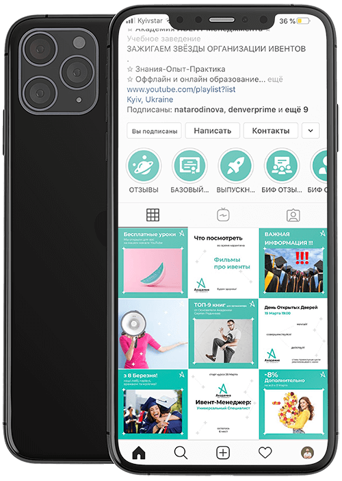
Instagram

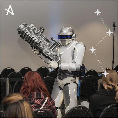
Photo
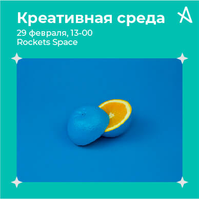
Photo + text
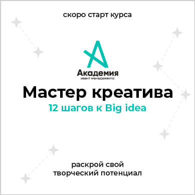
Only Text


Icons for assigned stories


Presentation





Rate this project
Let's discuss your project?
Contact me by email
Contacts
Or you can leave a request through the form and I will contact you within 1 hour (from 9 to 21)
Telegram
WhatsApp
Messenger


